
Welcome to R.
Packages
install.packages( ‘packageName’ )
Packages window is next to the Help window.
library( ‘packageName’ ): to load the package in. There may be some functions that have the same name with the original functions. So when you have loaded in some packages and you call a function with this kind of name, the function is in the package.
search on the internet for the documentations of these packages.
Review of Data Management
- Filter rows
- Sort the rows
- Select columns
- Add new columns
- Summarize data(use tapply): pay attention to the ‘na.rm’ parameter.
The ‘dplyr’ Packge
- Filter rows
1
2
# Select rows that Species is equal to "virginica"
filter( iris, Species == "virginica" ) - Sort the rows
1
2
3
# Sort iris with Sepal.Length decreasing
# In default, it is in an increasing order
arrange( iris, desc( Sepal.Length ) ) - Select columns
1
2
3
# Select one or more columns
select( iris,
Sepal.Length, Sepal.Width, Species) - Add new columns
1
2
3
4
# Add a column at the end
mutate( iris,
Sepal.Product = Sepal.Width * Sepal.Length )
# By the way, "mutate" means change, but it's normally in a bad way. - Summarize data
1
2
3
4
5
6
7
8
# This will return a data frame to us
# with one column: mean(Sepal.Length)
summarize( iris, mean(Sepal.Length) )
# This will return a data frame
# with two columns: Species and Sepal.Length
iris.grouped <- group_by( iris, Species )
summarize( iris.grouped, mean(Sepal.Length) )
Data Visualization
Box Plot
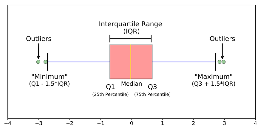
The boxplot is another way to visualize a one-dimensional distribution of data, but it’s more abstract than the strip chart or the histogram. Instead, a boxplot only displays a few aspects of the data:
First, the center of the boxplot is a box with a line in the middle of the box. This line represents the median of the data, which is the value such that 50% of the data is bellow the value and 50% of the data is above the value.
1 |
boxplot( rivers, |
There’s a much more interesting way to use boxplots, however. Rather than just look at one group, we can also show all of the subgroup-specific boxplots in one graph.( Think about the stripcharts we drew before.)
1 |
boxplot( iris$Sepal.Length ~ iris$Species, |
Multi-facted display
1 |
# We set R to make graphs of 3 rows and 1 column. |
Todays Tips
- Let CHEAT SHEET help you.


近期评论