
Learning matplotlib, a lib to draw chart, figure, etc..
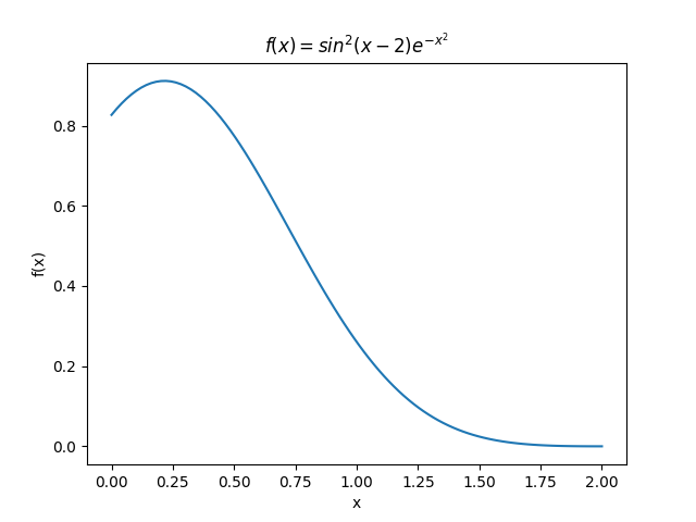
Plot the function
$$ f(x) = sin^2(x-2)e^{-x^2} $$
over the interval [0, 2]. Add proper axis labels, a title, etc.
Code
1 |
import matplotlib.pyplot as plt |
Result
Knowledge
- 用
pip3 install matplotlib进行安装 - 遇到问题
ModuleNotFoundError: No module named 'tkinter',按教程解决,即用apt install python3-tk安装。 - 用
plot绘制曲线,xlabel、ylabel设置坐标轴名称,title设置图像标题
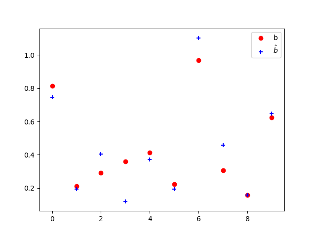
Exercise 11.2: Data
Create a data matrix X with 20 observations of 10 variables. Generate a vector b with parameters. Then generate the response vector $y = Xb+z$ where z is a vector with standard normally distributed variables.
Now (by only using y and X), find an estimator for b, by solving
$$ hat{b} = argminlimits_{b} || Xb-y ||_2 $$
Plot the true parameters b and estimated parameters b̂. See Figure 1 for an example plot.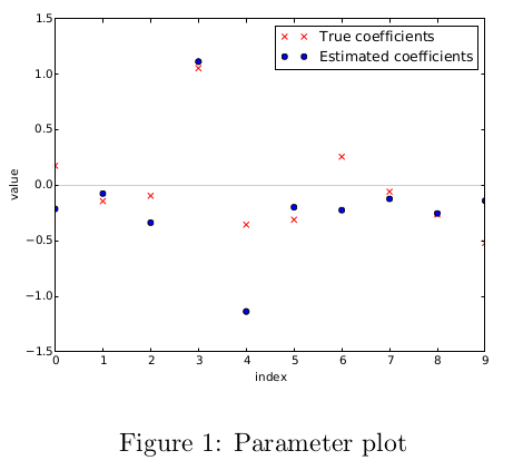
Code
1 |
import matplotlib.pyplot as plt |
Result
Knowledge
.dot()点乘lstsq()最小二乘法scatter散点图legend显示图例
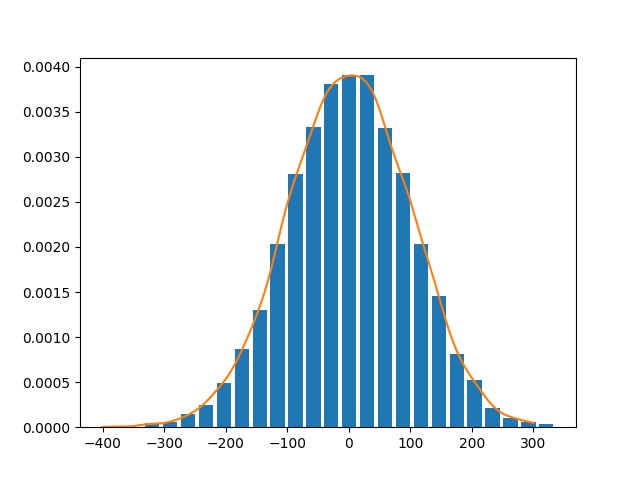
Exercise 11.3: Histogram and density estimation
Generate a vector z of 10000 observations from your favorite exotic distribution. Then make a plot that
shows a histogram of z (with 25 bins), along with an estimate for the density, using a Gaussian kernel
density estimator (see scipy.stats). See Figure 2 for an example plot.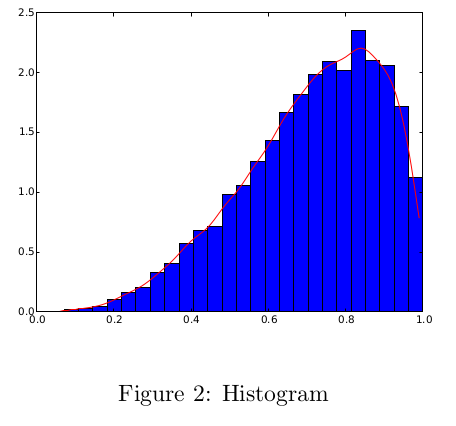
Code
1 |
import matplotlib.pyplot as plt |
Result
Knowledge
histto draw a histogramscipy.stats.gaussian_kdeto create Gaussian kernel density estimator.


近期评论