
Redesign MoMA Museum Website
Web Design | 04.2016
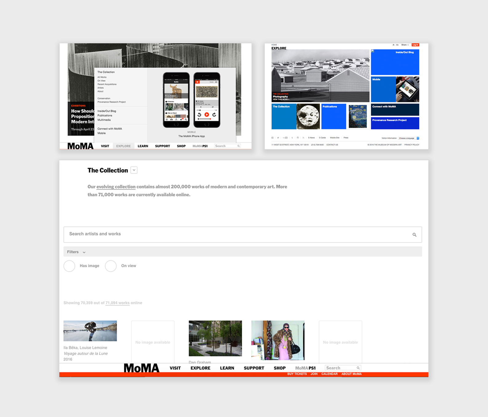
The Original Web:
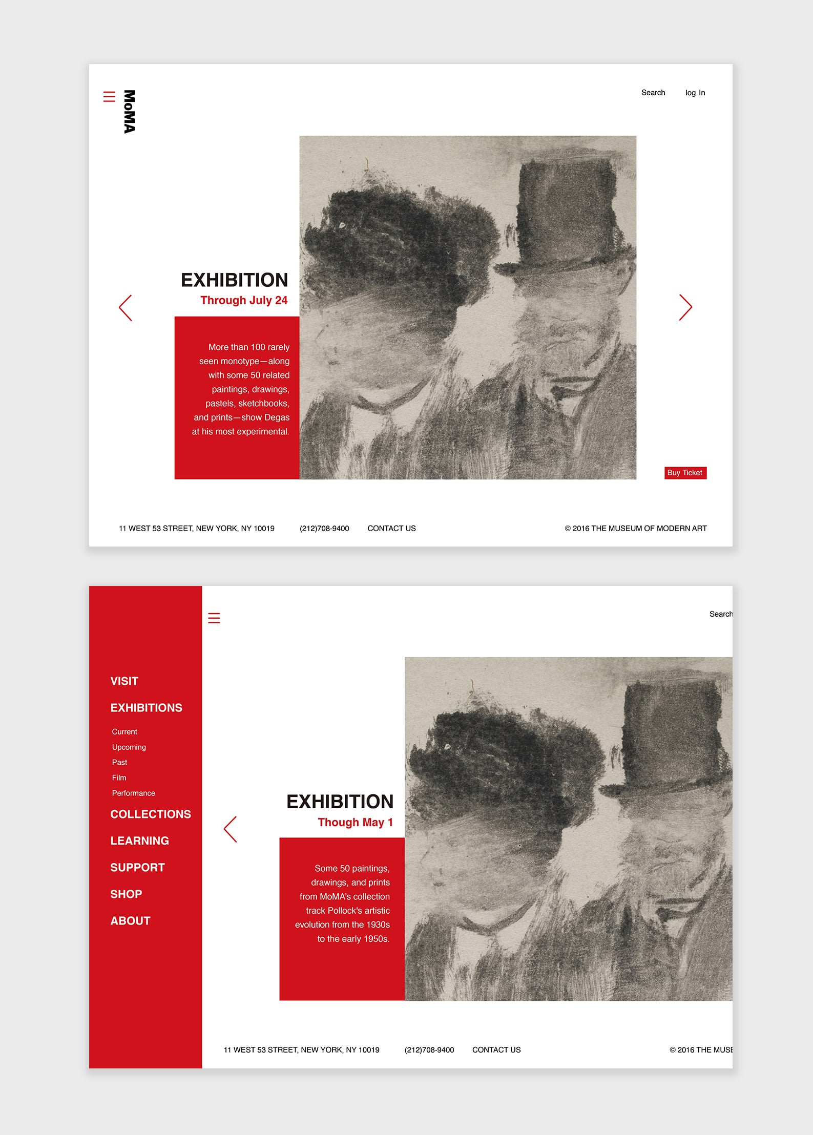
The New Web:
The navigation in the website includes too much information. The visual language is unclearly and doesn’t fit the visual identity of MOMA.
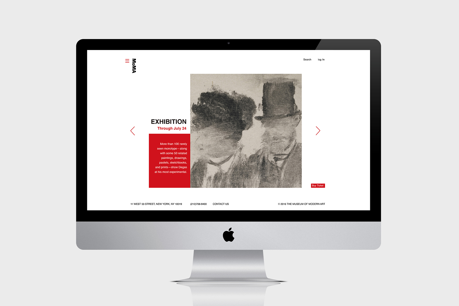
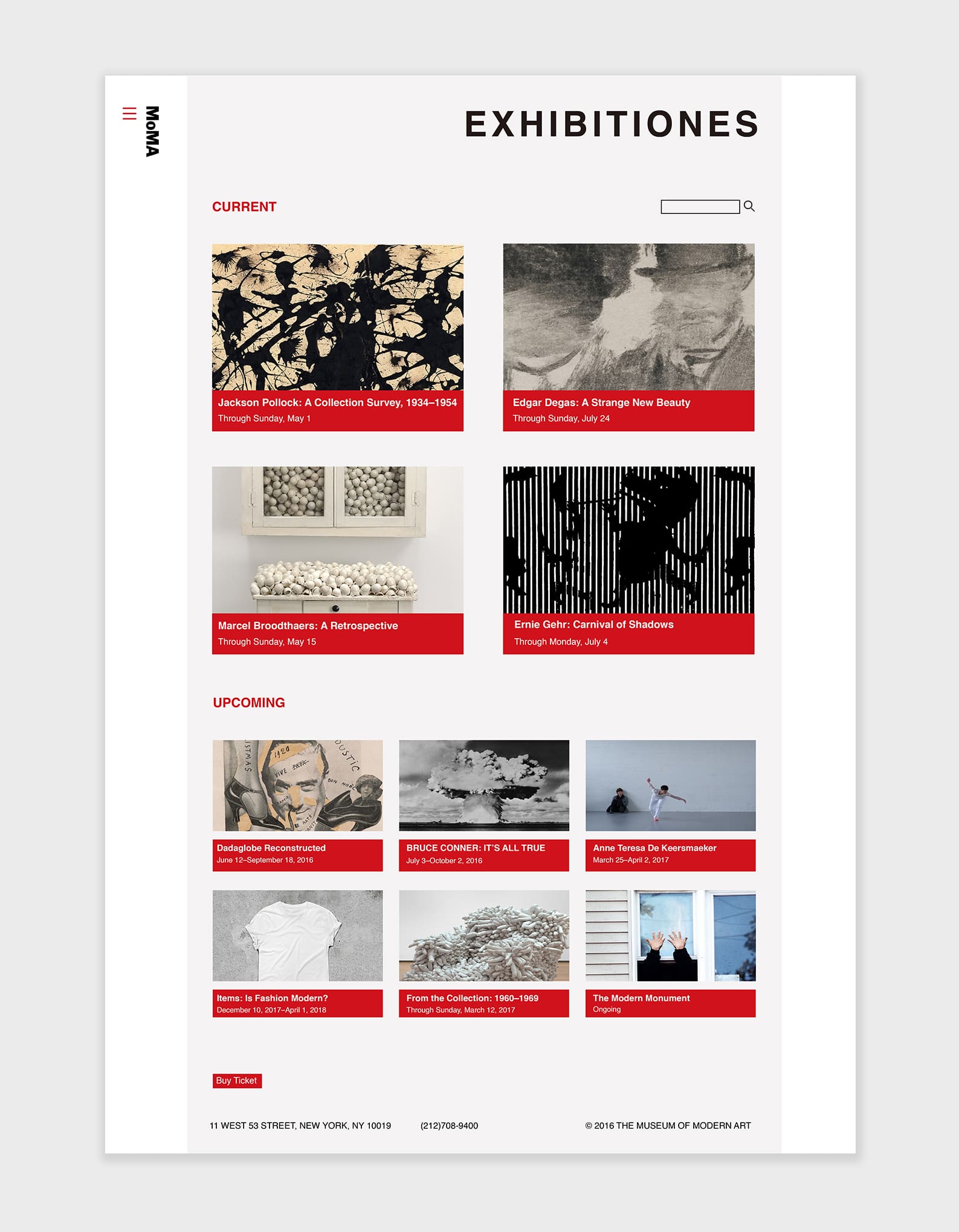
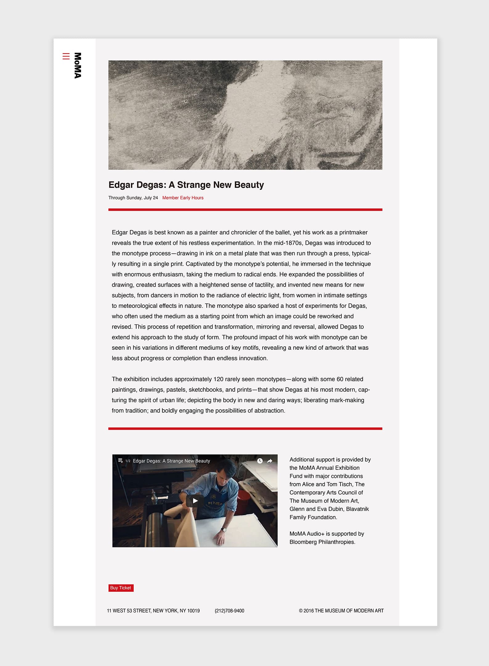
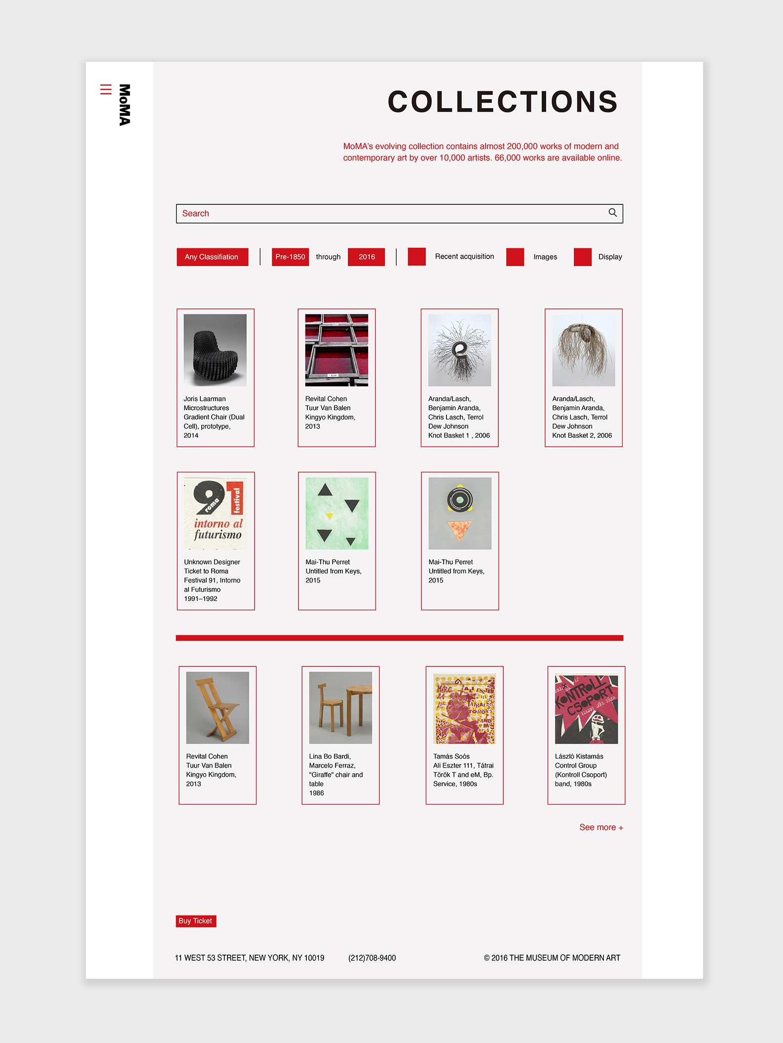
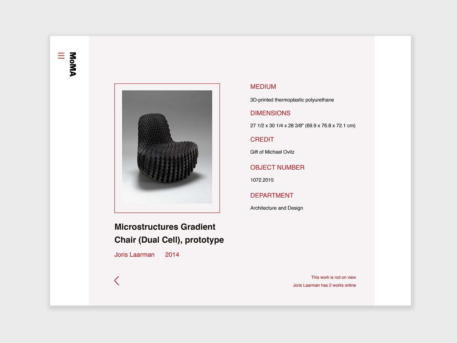
When I redesigning this website, I decided to use red, white and black as my main color which come from the visual identity of MOMA logo. The first thing is to redesign the navigation. The new navigation has a new interaction and it will also fit well in mobile devices. Another thing is, I simplify the system, and try to help people to find the correct information easily.
When I redesigning this website, I decided to use red, white and black as my main color which come from the visual identity of MOMA logo. The first thing is to redesign the navigation. The new navigation has a new interaction and it will also fit well in mobile devices. Another thing is, I simplify the system, and try to help people to find the correct information easily.
Explor it here: https://invis.io/J975ZNZ8G/


近期评论