
So I have been working on a paper proposing a new hierarchical model to analyze single-cell RNA-Seq data. As a proof of concept, we wrote our program TASC to perform the differential expression analyses using scRNA-Seq counts. It was all good until we had to put together all the simulation results and all the real data analyses into a few figures. The process was quite tedious and full of pitfalls that might baffle the most experienced R users. Suffice to say, I have learned quite a bit about the r packages ggplot2, ggthemes, gridExtra, RColorBrewer and Cairo. This post is a summary of what I have learned.
ggplot2 is a boon to any R user who is attempting to produce high quality figures of complexity and aesthetics. Its design philosophy is quite simple, each layer in the plot, be it a line graph, be it a boxplot, be it a scatterplot, etc, can all be added one after another onto the same graphing area with the operator “+”. For example, the following code shows how to add points to the line graph.
# generate data
x <- seq(0,30,length.out = 10); y <- 5+0.0713*x^2+2.3056*x+rnorm(10,sd = 5)

# load libraries
library(ggplot2); library(RColorBrewer); library(gridExtra)

# generate color scheme
color.scheme <- brewer.pal(3,'Accent')


# draw line graph
grob1 <- ggplot(data.frame(x=x,y=y))+geom_line(aes(x=x,y=y),color=color.scheme[1],lty=2)+ggtitle("Line Graph Only")

# draw points
grob2 <- grob1 + geom_point(aes(x=x,y=y),color=color.scheme[2])+ggtitle("With Points")

# change theme
grob3 <- grob2 + theme_minimal()+ggtitle("Minimal Theme")+xlab("Age [year]")+ylab("Weight [kg]")+scale_x_continuous(breaks=c(0,10,20,30))+scale_y_continuous(breaks = c(0,50,100))

# save to pdf
cairo_pdf('ggplot2_tutorial_1.pdf',width = 9,height = 3, onefile = T,family = 'GT Walsheim Pro Trial Regular')
grid.arrange(grob1,grob2,grob3,nrow=1)
dev.off()
The end result is this elegant and minimalistic figure: 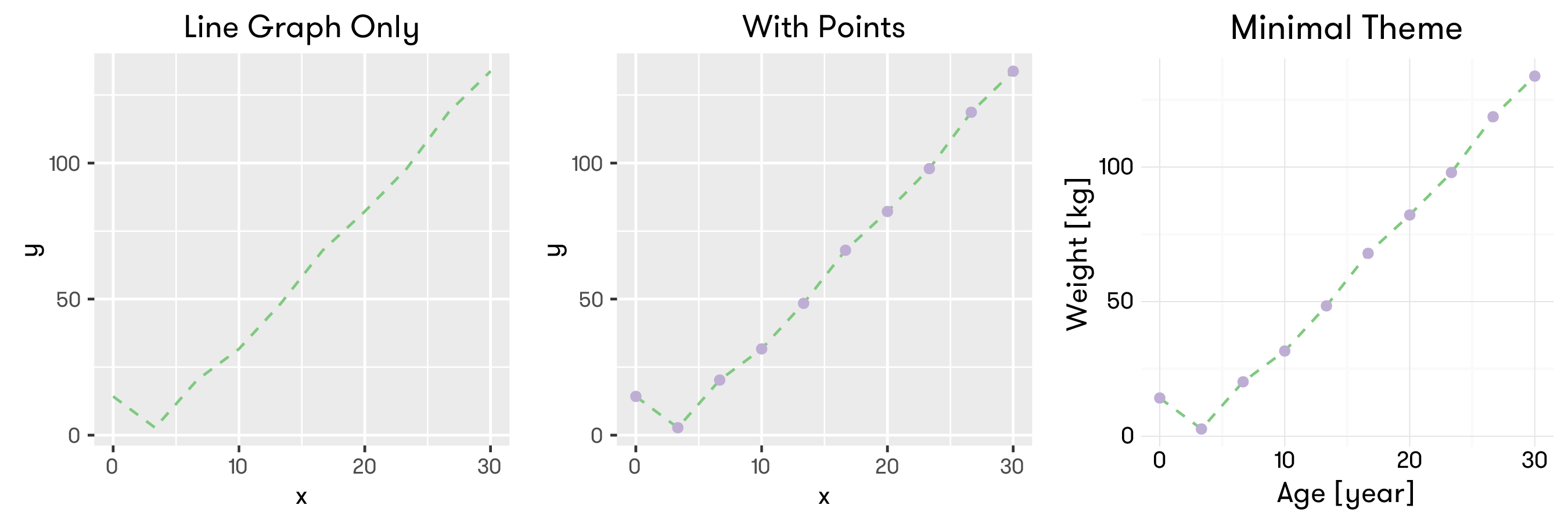
When producing a nice ggplot2 graph, the following pointers might be useful:
-
Each grob is an object recording the steps to generate the graph. They can be modified to include more features (as in the case of added points to the line graph), or their properties can be changed by setting certain options with the theme functions (in our case, we changed the theme to a minimalistic theme).
- To change the title, use
+ggtitle() - To change the axis text, use
+xlab()and+ylab() - To change the axis limits, use
+xlim(lower,upper)and+ylim()
- To change the title, use
-
cairo_pdf is a function provided with base R to write the graphs to a PDF device. The advantage of using cairo_pdf is that you can specify font families that do not belong to the default family. In our example, we used GT Walsheim as the default type face.
-
RColorBrewer is a great package for generating color palettes that are aesthetically pleasing. It only takes a little effort to spruce up our graphs with some elegant and legible colors, so the end result is totally worth the couple of lines of extra code.
Another great feature of ggplot2 is that it can generate graphs for different groups of data automatically. Now consider we have the following data.frame in R.
| Age | Weight | Person |
|---|---|---|
| 0.000000 | 0.332950 | Individual 1 |
| 3.333333 | 12.692231 | Individual 1 |
| 6.666667 | 31.127298 | Individual 1 |
| … | … | … |
| 23.333333 | 62.827906 | Individual 2 |
| 26.666667 | 67.223182 | Individual 2 |
| 30.000000 | 78.751400 | Individual 2 |
We want to draw the age-weight curves for both individuals in one plot. ggplot2 makes this task a breeze. However, tweaking the format and positioning of the legends can be a little tricky.
# generate data
x <- seq(0,30,length.out = 10)
y1 <- 5+0.0713*x^2+2.3056*x+rnorm(10,sd = 5)
y2 <- 5+0.0313*x^2+1.56*x+rnorm(10,sd = 5)
gg.df <- data.frame(Age=rep(x,times=2),
                    Weight=c(y1,y2),
                    Person=rep(c('Individual 1', 'Individual 2'),each=length(x)))

# generate lines for two individuals
grob1 <- ggplot(gg.df,aes(x=Age,y=Weight))+
  geom_line(aes(color=Person,lty=Person))+
  geom_point(aes(color=Person,shape=Person))+
  scale_color_manual(values = color.scheme)+ggtitle('Default')

# change theme, and tweak the position of the legend title
grob2 <- grob1 + theme_minimal() + guides(color=guide_legend(title.hjust =0.5),
                                         shape=guide_legend(title.hjust =0.5),
                                         lty=guide_legend(title.hjust =0.5)) + ggtitle('Centered Legend Title')

# move the legend inside the plot
grob3 <- grob2 + theme(legend.position = c(0, 1),legend.justification = c(0, 1)) + ggtitle('Legend Inside')

# save to pdf
cairo_pdf('ggplot2_tutorial_2.pdf',width = 9,height = 3, onefile = T,family = 'GT Walsheim Pro Trial Regular')
grid.arrange(grob1,grob2,grob3,nrow=1)
dev.off()
ggplot2 is nice in that it automatically draws two lines for you according to the variable name you passed to it, and generates legends automatically too. However, its legend is placed outside the graphing area (grey), a choice that usually has a lot of graphing area wasted and renders the final result cumbersome and unattractive. Moreover, the title of the legend is left-justified, which drives a person with slight OCD like me crazy. We changed all that, and the end result shows legend inside the plotting area and the title of the legend centered. 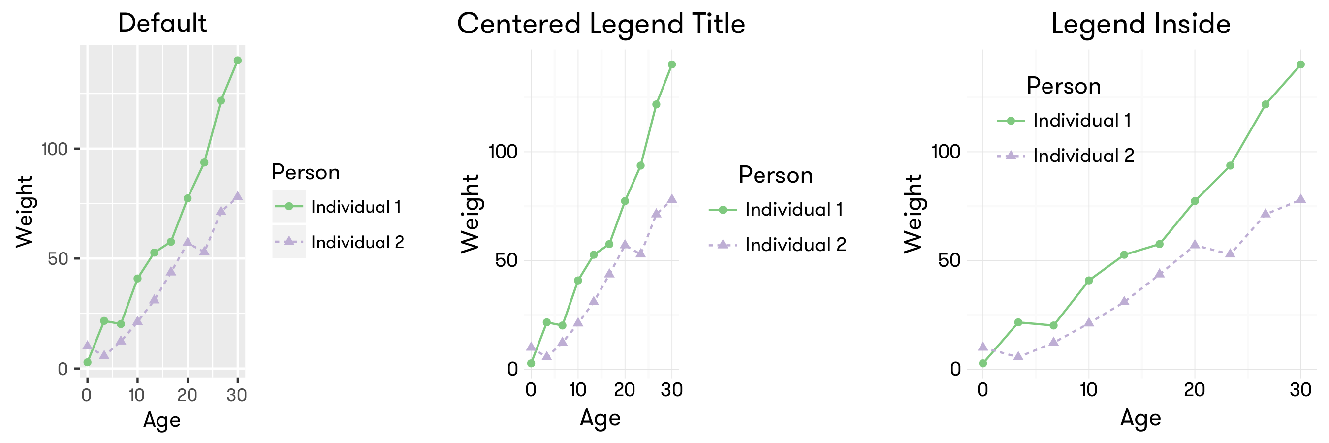
- ggplot2 automatically plots two groups using different “lty”, “color” and “shape”, defined in the
geom_lineandgeom_pointcommands used above. The custom Brewer color scheme is passed to ggplot2 with thescale_color_manualcommand.aesis short for aesthetics, as it is used for generating aesthetics mapping for ggplot2. In our example, - the information about the variables used for x and y axes are passed to ggplot using aes;
- the variables for which different line colors and line types (lty) are used are passed to geom_line with aes;
- the variables for which different point colors and point shapes (shape) are used are passed to geom_point with aes.
- the position of the legend title w.r.t the legends is tweaked with guides function. Note we have to adjust the title.hjust parameter for ALL properties with which the legends are generated.
- the position of the legend itself is tweaked with legend.position and legend.justification parameter. The origin (0,0) of the coordinates lies in the BOTTOM LEFT corner of your plot. legend.justification changes the justification WITHIN the legend, i.e., where inside the legend will be placed at legend.position. legend.position just indicates where exactly in the plotting area (grey area by default) the legend will be placed.
To further illustrate how legend.position and legend.justification work, I have generated three more figures with different positions for the legend.
grob4 <- grob2 + theme(legend.position = c(1, 1),legend.justification = c(1, 1)) + ggtitle('Top Right')
grob5 <- grob2 + theme(legend.position = c(1, 0),legend.justification = c(1, 0)) + ggtitle('Bottom Right')
grob6 <- grob2 + theme(legend.position = c(0, 0),legend.justification = c(0, 0)) + ggtitle('Origin')

# save to pdf
cairo_pdf('ggplot2_tutorial_3.pdf',width = 9,height = 3, onefile = T,family = 'GT Walsheim Pro Trial Regular')
grid.arrange(grob4,grob5,grob6,nrow=1)
dev.off()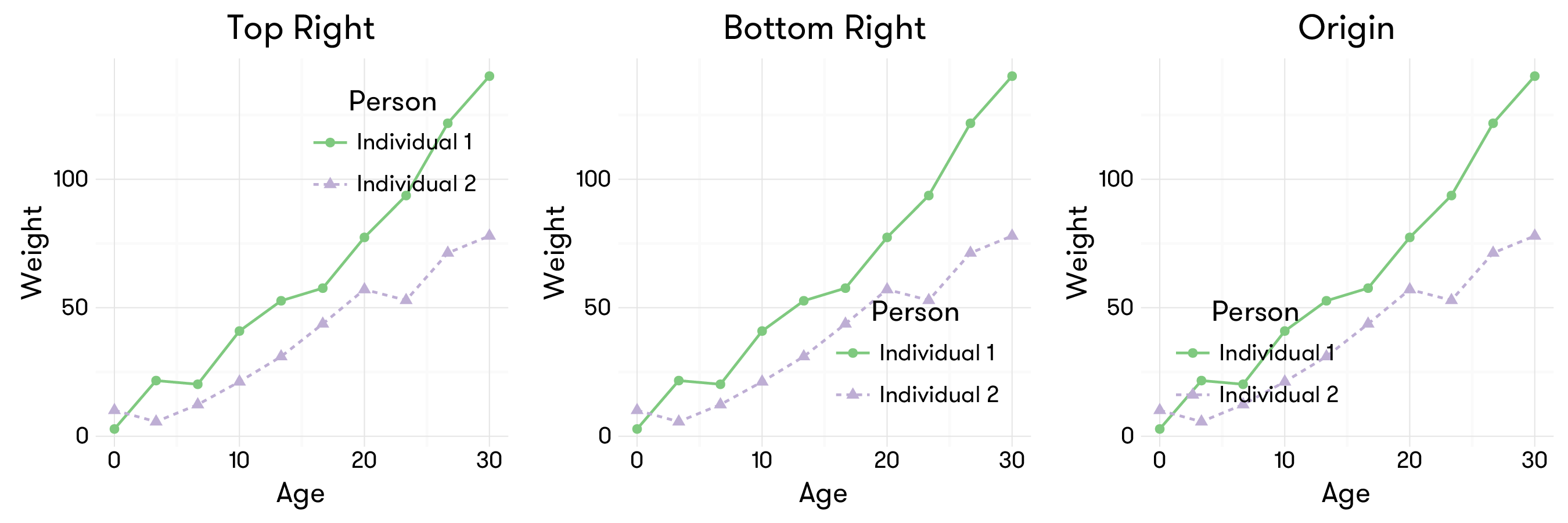
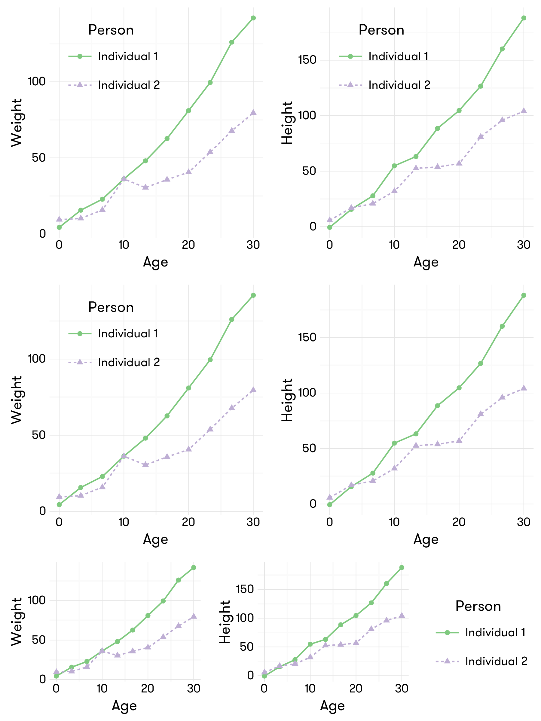
The last piece of note is about sharing legend. Sometimes you are making several different figures using the same groups, i.e., you only need one set of legends. In this case, you can either
- hide the legends in all panels but one, or
- extract the legends and place it outside.
The following R code is an example for both of the above situations.
x <- seq(0,30,length.out = 10)
y1 <- (5+0.0713*x^2+2.3056*x+rnorm(10,sd = 5))*1.33
y2 <- (5+0.0313*x^2+1.56*x+rnorm(10,sd = 5))*1.33
gg.df2 <- data.frame(Age=rep(x,times=2),
                    Height=c(y1,y2),
                    Person=rep(c('Individual 1', 'Individual 2'),each=length(x)))

extract.legend<-function(a.gplot){
  tmp <- ggplot_gtable(ggplot_build(a.gplot))
  leg <- which(sapply(tmp$grobs, function(x) x$name) == "guide-box")
  legend <- tmp$grobs[[leg]]
  return(legend)}

grob11 <- ggplot(gg.df,aes(x=Age,y=Weight))+
  geom_line(aes(color=Person,lty=Person))+
  geom_point(aes(color=Person,shape=Person))+
  scale_color_manual(values = color.scheme) +
  theme_minimal() +
  guides(color=guide_legend(title.hjust =0.5),
         shape=guide_legend(title.hjust =0.5),
         lty=guide_legend(title.hjust =0.5))+
  theme(legend.position = c(0, 1),legend.justification = c(0, 1))
grob12 <- ggplot(gg.df2,aes(x=Age,y=Height))+
  geom_line(aes(color=Person,lty=Person))+
  geom_point(aes(color=Person,shape=Person))+
  scale_color_manual(values = color.scheme) +
  theme_minimal() +
  guides(color=guide_legend(title.hjust =0.5),
         shape=guide_legend(title.hjust =0.5),
         lty=guide_legend(title.hjust =0.5))+
  theme(legend.position = c(0, 1),legend.justification = c(0, 1))

grob1 <- arrangeGrob(grob11,grob12,nrow=1)

grob21 <- ggplot(gg.df,aes(x=Age,y=Weight))+
  geom_line(aes(color=Person,lty=Person))+
  geom_point(aes(color=Person,shape=Person))+
  scale_color_manual(values = color.scheme) +
  theme_minimal() +
  guides(color=guide_legend(title.hjust =0.5),
         shape=guide_legend(title.hjust =0.5),
         lty=guide_legend(title.hjust =0.5))+
  theme(legend.position = c(0, 1),legend.justification = c(0, 1))
grob22 <- ggplot(gg.df2,aes(x=Age,y=Height))+
  geom_line(aes(color=Person,lty=Person))+
  geom_point(aes(color=Person,shape=Person))+
  scale_color_manual(values = color.scheme) +
  theme_minimal() +
  guides(color=guide_legend(title.hjust =0.5),
         shape=guide_legend(title.hjust =0.5),
         lty=guide_legend(title.hjust =0.5))+
  theme(legend.position = 'none')

grob2 <- arrangeGrob(grob21,grob22,nrow=1)


grob31 <- ggplot(gg.df,aes(x=Age,y=Weight))+
  geom_line(aes(color=Person,lty=Person))+
  geom_point(aes(color=Person,shape=Person))+
  scale_color_manual(values = color.scheme) +
  theme_minimal() +
  guides(color=guide_legend(title.hjust =0.5),
         shape=guide_legend(title.hjust =0.5),
         lty=guide_legend(title.hjust =0.5))

grob.legend <- extract.legend(grob31)
grob31 <- grob31 + theme(legend.position='none')

grob32 <- ggplot(gg.df2,aes(x=Age,y=Height))+
  geom_line(aes(color=Person,lty=Person))+
  geom_point(aes(color=Person,shape=Person))+
  scale_color_manual(values = color.scheme) +
  theme_minimal() +
  guides(color=guide_legend(title.hjust =0.5),
         shape=guide_legend(title.hjust =0.5),
         lty=guide_legend(title.hjust =0.5))+
  theme(legend.position = 'none')


grob3 <- arrangeGrob(arrangeGrob(grob31,grob32,nrow=1),grob.legend,nrow=1,widths=c(10,3))

# save to pdf
cairo_pdf('ggplot2_tutorial_4.pdf',width = 6,height = 8, onefile = T,family = 'GT Walsheim Pro Trial Regular')
grid.arrange(grob1,grob2,grob3,ncol=1,heights=c(5,5,3))
dev.off()
The results are like this:


近期评论