
A pieChart and paretoChart exercise
import numpy as np
import pandas as pd
import matplotlib.pyplot as plt
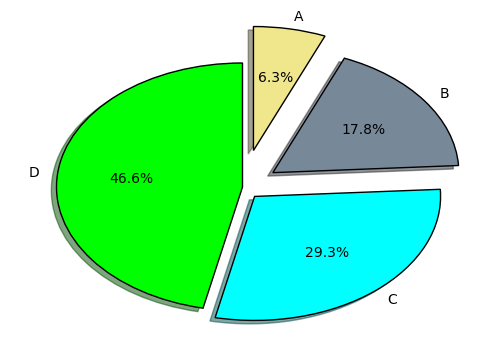
data = pd.DataFrame([12,34,56,89],index=['A','B','C','D'])

data = pd.DataFrame([12,34,56,89],index=['A','B','C','D'])
data
| 0 | |
|---|---|
| A | 12 |
| B | 34 |
| C | 56 |
| D | 89 |
data.T
| A | B | C | D | |
|---|---|---|---|---|
| 0 | 12 | 34 | 56 | 89 |
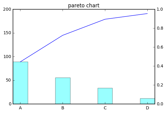
sortedData = data.sort_values(by=0,ascending=False)

sortedData
| 0 | |
|---|---|
| D | 89 |
| C | 56 |
| B | 34 |
| A | 12 |
explode = [0,0.1,0.2,0.3]
colors = ['lime','aqua','lightslategrey','khaki']

plt.pie(sortedData.values,
              explode=explode,
              labels=sortedData.index,
              colors=colors, autopct='%1.1f%%',
              pctdistance = 0.6,
              shadow = True, startangle = 90)
#plt.axis('equal')
plt.figure(figsize=(10,9))
plt.show()
<matplotlib.figure.Figure at 0xad3ea90>
plt.bar(np.arange(4),sortedData.values,width=0.35, color='aqua', alpha=0.4,align='center')
plt.xticks(np.arange(4),['A','B','C','D'])
plt.plot(sortedData.cumsum().values)
plt.title("pareto chart")
plt.twinx()
plt.show()


近期评论